FEATS Outlier Analysis
In this notebook, we perform outlier analysis using FEATS on mouse intestine dataset.
Import libraries
The first step is to import the Python libraries for performing the analysis.
# Import core libraries
import numpy as np
import pandas as pd

import json

# Import our libraries
from singlecelldata import SingleCell
from feats import DetectOutliers, Cluster


# Import Plotting Functions
from scplotlib import tSNEPlot, PlotOutlierScores
Load data
The next step is to load the data into this notebook environment.
# Python dictionary storing dataset specific parameters.
dataset_params = json.load(open("dset_param.txt"))

dataset = "intestine"
dset_name = dataset_params[dataset]['dset_name']

path = "datasets/"
data_path = path + dset_name + '/' + dset_name + "_data.csv"
celldata_path = path + dset_name + '/' + dset_name + "_celldata.csv"
genedata_path = path + dset_name + '/' + dset_name + "_genedata.csv"

data = pd.read_csv(data_path, index_col=0)
celldata = pd.read_csv(celldata_path, index_col=0)
genedata = pd.read_csv(genedata_path, index_col = 0)

# Create a single cell object
sc = SingleCell(dataset,data,celldata,genedata)

# Get parameters from the dictionary
label = dataset_params[dataset]['label']
nc = dataset_params[dataset]['nc']

# sc.print()
Perform clustering
Clustering is performed prior to performing outlier analysis. We use the FEATS Cluster function and specify the number of clusters using the k parameter. We apply the cosine normalization on the data and use the full gene space to search for the optimal number of top genes/features. For more information on the Cluster function run help(Cluster).
# Perform clustering
sc, _ = Cluster(
    sc,
    k = nc,
    normalization = 'cosine',
    q = np.arange(1, sc.dim[0] + 1)
    )
Computing Temporary Clusters . . .
Performing Feature Selection . . .
Computing 6 clusters using best features . . .
Saving final cluster labels in Single Cell object . . .
Perform outlier detection
After clustering, we can call the DetectOutliers function to compute outliers. We have to provide the cluster information using the cluster_label argument. We use ‘FEATS_6_Clusters’, which is the column under which FEATS stores the computed cluster label information. We select the reduced dimensionality, red_dim as 2 and the probability threshold for outliers outlier_prob_thres as $10^{-4}$.
sc = DetectOutliers(sc,
                    cluster_label = 'FEATS_6_Clusters',
                    red_dim = 2,
                    outlier_prob_thres = 10**-4)
Computing outliers . . .
Number of outliers =  1
Number of points in out of sample =  11
Saving outlier information in Single Cell object . . .
Visualization
Using functions from the scplotlib library, we can visualize the outputs of the outlier detection method stored in the SingleCell object. The FEATS outlier detection function saves various parameters such as outlier scores, whether or not a cell is an outlier, etc., in the celldata assay of the SingleCell object. Run help(DetectOutliers) for more information. We can use these parameters to generate visualization. The PlotOutlierScores function generates a vertical bar plot of the outlier scores for each cell (fig1). You have to specify the name of the column which stores the outlier scores using the outlier_score argument. Additionally, we can also color the bars for different cell types using the color_by argument and plot a threshold line using the threshold argument. We have to specify the data column which stores these parameters. For other arguments see scplotlib documentation.
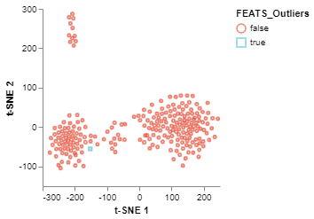
The tSNEPlot function of the scplotlib can be used to generate two dimensional scatter plot. This function reduces the dimensionality via tSNE using tSNE parameters (arguments which start using the tsne_ prefix). The tSNEPlot function has been used to generate a 2D scatter plot (fig2) by coloring the data points using cluster labels generated by FEATS (‘FEATS_6_Clusters’). We can also show which samples are outliers by specifying the marker color (color_by) and shape (shape_by) arguments (fig3). Here we show which samples are outliers by specifying ‘FEATS_outliers’ for those arguments.
fig1 = PlotOutlierScores(sc,
                         outlier_score = 'FEATS_Outlier_Score',
                         color_by = 'FEATS_6_Clusters',
                         threshold = 'Outlier_Thres',
                         height = 200,
                         width = 200)
fig1.show()
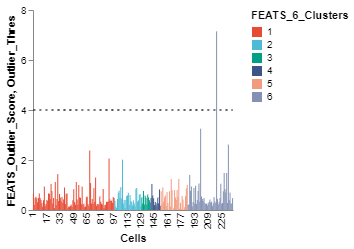
fig2 = tSNEPlot(sc,
                color_by = 'FEATS_6_Clusters',
                tsne_iterations = 400,
                tsne_perplexity = 50,
                tsne_init = 'pca',
                tsne_random_state = 0,
                marker_size = 10,
                marker_thickness = 2)
fig2.show()
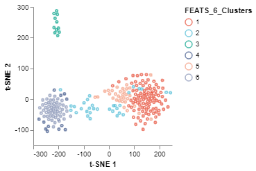
fig3 = tSNEPlot(sc,
                color_by = 'FEATS_Outliers',
                marker_by = 'FEATS_Outliers',
                tsne_iterations = 400,
                tsne_random_state = 0,
                tsne_perplexity = 50,
                tsne_init = 'pca',
                marker_size = 10,
                marker_thickness = 2)
fig3.show()